Descriptive Statistics and Visualizations
By Josh McCrain
 Twitter
1 Introduction
In the previous guides I covered how to wrangle both prepared datasets and separate, more niche data into workable formats. But what does workable mean? For academics and researchers like myself, it means it’s in a format for which we can run regressions or produce useful visualizations.
This guide covers exactly how to do that. You’ll learn how to produce publication-ready visualizations using off-the-shelf data and new descriptives about these data using the work you’ve done previously in this guide (don’t worry, if you didn’t follow along links are provided to download). Specifically, we’ll be using some cleaned cosponsorship data and distributive spending data.
You’ll learn quite a bit about tidyverse window functions such as group_by and summarize. You’ll also gain some experience with the most useful ggplot2 visualization functions such as geom_density and geom_smooth.
2 Describing and visualizing data
One of the first things I do when working with a new dataset before running models is explore it. In my opinion, this is useful because it tells us a lot about the data that we can’t see by looking at it in its raw form. It also will highlight errors in the data, missingness, or other weirdness that may not be obvious.
Once you get your mind wrapped around the intuition of tidyverse functions and ggplot2 this is a lot of fun. Let’s get started:
2.1 Preparing the workspace
First, set your working directory to the directory of your R file and load the tidyverse and readxl packages. Then, load in the Volden and Wiseman Legislative Effectiveness Data for the House (discussed in the previous guide). Next, load in some of the covariates we created in the previous guide on messy data; specifically, data on cosponsorship and distributive spending. If you don’t want to go through the previous guide, you can find the .RData file here.
library(tidyverse)
library(readxl)

vw <- read_excel("data/CELHouse93to115.xlsx")
load("data/additional_covariates.RData")
You should now see three dataframes in your workspace. The abh dataframe includes federal outlays per district per congress (logged) and the cosp.panel dataframe includes total cosponsors, total bills introduced, and average cosponsors per bill per member per congress.
2.2 Preparing the data
Now let’s merge these datasets together – something that will be easy since they were prepared as such previously. We do have to change some of the variable names in vw since they’re not particularly well-named as is.
vw <- vw %>%
  rename(icpsr = `ICPSR number, according to Poole and Rosenthal`,
         cong = `Congress number`,
         state = `Two-letter state code`,
         district = `Congressional district number`,
         name = `Legislator name, as given in THOMAS`)

vw <- left_join(vw, abh) %>%
  left_join(cosp.panel)
## Joining, by = c("cong", "state", "district")## Joining, by = c("icpsr", "cong")It’s important to note that each of these datasets has different years of coverage, so that will limit some of our analyses:
## [1] 98 99 100 101 102 103 104 105 106 107 108 109 110 111## [1] 107 108 109 110 111 112 113 114## [1] 93 94 95 96 97 98 99 100 101 102 103 104 105 106 107 108 109
## [18] 110 111 112 113 114 1152.3 Basic summary statistics
One of the first things you might do when working with new data is put together some basic summary statistics. This will definitely be a step that will get done at some point when writing an academic paper – as a reviewer, I always want to see this table somewhere in the paper. There are quite a few ways to do this.
First, let’s put together the classic summary statistics table that just tells us things like the IQR, mean, median, min and max of some variables of interest. I like using the stargazer package for this, but there are other methods. I’ll output the summary statistics table into LaTeX code using stargazer which is most frequently what I end up doing. I’m also only going to grab a few variables for this step:
# install.packages("stargazer")
library(stargazer)

vw %>%
  ungroup %>%
  select(Female = `1 = female`,
         `Vote Share` = `Percent vote received to enter this Congress`,
         `Total Cosponsors` = total_cosponsor,
         `Average Cosponsors` = avg_cosponsor,
         `Legislative Effectiveness Score` = `Legislative Effectiveness Score (1-5-10)`) %>%
  as.data.frame %>%
  stargazer(digits=1)
##
## % Table created by stargazer v.5.2.2 by Marek Hlavac, Harvard University. E-mail: hlavac at fas.harvard.edu
## % Date and time: Mon, Jun 08, 2020 - 10:08:29 AM
## \begin{table}[!htbp] \centering
## \caption{}
## \label{}
## \begin{tabular}{@{\extracolsep{5pt}}lccccccc}
## \\[-1.8ex]\hline
## \hline \\[-1.8ex]
## Statistic & \multicolumn{1}{c}{N} & \multicolumn{1}{c}{Mean} & \multicolumn{1}{c}{St. Dev.} & \multicolumn{1}{c}{Min} & \multicolumn{1}{c}{Pctl(25)} & \multicolumn{1}{c}{Pctl(75)} & \multicolumn{1}{c}{Max} \\
## \hline \\[-1.8ex]
## Female & 10,263 & 0.1 & 0.3 & 0 & 0 & 0 & 1 \\
## Vote Share & 9,900 & 68.1 & 13.7 & 23.0 & 58.0 & 74.0 & 100.0 \\
## Total Cosponsors & 3,514 & 296.3 & 278.6 & 0.0 & 101.0 & 402.0 & 2,571.0 \\
## Average Cosponsors & 3,514 & 17.7 & 13.3 & 0.0 & 8.2 & 23.8 & 120.2 \\
## Legislative Effectiveness Score & 10,263 & 1.0 & 1.5 & 0.0 & 0.2 & 1.2 & 18.7 \\
## \hline \\[-1.8ex]
## \end{tabular}
## \end{table}What’s going on here? First, I use the select function to limit the number of variables I want to summarize. Then, I pipe this into as.data.frame which is a weird quirk of stargazer – it needs to be explicitly told it’s a dataframe. Finally, I pipe that resulting dataframe into the stargazer function which produces the LaTeX code. There are lots of parameters you can pass stargazer – I recommend this guide. You can copy and paste the output of this code into your .tex document and you’ll have a good looking, publication ready table!
2.3.1 Other descriptive statistics
Let’s say you want to display some other types of descriptives of your data, perhaps something conditional like differences in legislator behavior based on party, time or ideological extremity. The tidyverse package makes this exceptionally easy.
2.3.1.1 Cosponsorship by extremity
Let’s first show how cosponsorship varies by ideological extremity. Then, we’ll see how many female legislators there are over time.
The idea is we’ll want to group the data by the quantity of interest – in this first example, ideological extremity – and them summarize based on the output of interest – cosponsorhip.
To measure extremity political scientists typically use the absolute value of the first dimension of DW-NOMINATE scores. The intuition is this is how far away you are from the median, regardless of party. This, however, is a continuous variable somewhat complicating things as the code below shows:
# first, create the variable
vw$abs_val_dwn <- abs(vw$`First-dimension DW-NOMINATE score`)

vw %>%
  ungroup %>%
  group_by(abs_val_dwn) %>%
  summarize(mean = mean(avg_cosponsor, na.rm=T)) %>%
  sample_n(10)
## # A tibble: 10 x 2
## abs_val_dwn mean
## <dbl> <dbl>
## 1 0.742 44.5
## 2 0.165 NaN
## 3 0.318 11.3
## 4 0.324 16.4
## 5 0.325 7.73
## 6 0.299 15.6
## 7 0.358 21.5
## 8 0.575 18.5
## 9 0.456 12.0
## 10 0.480 26.6This isn’t particularly useful. One approach is to bin the values based on deciles (or another ntile). This will work much better:
vw %>%
  ungroup %>%
  mutate(decile = ntile(abs_val_dwn, 10)) %>%
  group_by(decile) %>%
  summarize(mean = mean(avg_cosponsor, na.rm=T))
## # A tibble: 11 x 2
## decile mean
## <int> <dbl>
## 1 1 15.4
## 2 2 15.5
## 3 3 16.3
## 4 4 16.1
## 5 5 17.7
## 6 6 17.7
## 7 7 18.3
## 8 8 18.0
## 9 9 17.7
## 10 10 19.2
## 11 NA 12.8Now we’re talking. This is a really interesting depiction of the data! It looks like, on average, more extreme members have more cosponsors per bill introduced, on average. We can also break this up by party:
vw %>%
  ungroup %>%
  filter(!is.na(abs_val_dwn)) %>%
  mutate(party = ifelse(`1 = Democrat`==1, "Democrat", "Republican")) %>%
  mutate(quintile = ntile(abs_val_dwn, 5)) %>%
  group_by(quintile, party) %>%
  summarize(mean = mean(avg_cosponsor, na.rm=T))
## # A tibble: 10 x 3
## # Groups: quintile [5]
## quintile party mean
## <int> <chr> <dbl>
## 1 1 Democrat 14.7
## 2 1 Republican 19.7
## 3 2 Democrat 16.1
## 4 2 Republican 16.3
## 5 3 Democrat 18.0
## 6 3 Republican 17.0
## 7 4 Democrat 19.4
## 8 4 Republican 17.0
## 9 5 Democrat 22.1
## 10 5 Republican 17.7Very fascinating. There seem to be clear differences by party and extremity levels. Let’s break down this code:
filter(!is.na(abs_val_dwn)) %>%- Drop observations that are missing the 1st Dimension DW-NOMINATE scores
mutate(party = ifelse(1 = Democrat==1, "Democrat", "Republican")) %>%- This simply creates a variable called
partybased on the value of the variable1 = Democrat(which is self explanatory)
- This simply creates a variable called
mutate(quintile = ntile(abs_val_dwn, 5)) %>%- Here we create a new variable called
quintileusing the functiondplyr::ntile. This function takes two parameters, the data from which you want to create ntiles, and the number of breaks you want to make in the data. Here, it’s 5, thus quintiles.
- Here we create a new variable called
group_by(quintile, party) %>%- Group the data by both quintile and party
summarize(mean = mean(avg_cosponsor, na.rm=T))- Based on that grouping, summarize the data to get the mean of
avg_cosponsorper quintile and party.
- Based on that grouping, summarize the data to get the mean of
2.3.1.2 Member of Congress gender by party
Cool. Let’s do one final, simpler summary based on member of Congress gender:
vw %>%
  filter(cong >= 105) %>%
  rename(female = `1 = female`) %>%
  mutate(party = ifelse(`1 = Democrat`==1, "Democrat", "Republican")) %>%
  ungroup %>%
  group_by(party, cong) %>%
  summarize(`Total Female Members` = sum(female)) %>%
  pivot_wider(names_from = party,
              names_glue = "Female {party}",
values_from=`Total Female Members`)| cong | Female Democrat | Female Republican |
|---|---|---|
| 105 | 39 | 18 |
| 106 | 41 | 17 |
| 107 | 44 | 18 |
| 108 | 42 | 21 |
| 109 | 46 | 25 |
| 110 | 57 | 21 |
| 111 | 62 | 17 |
| 112 | 54 | 24 |
| 113 | 65 | 20 |
| 114 | 66 | 23 |
| 115 | 70 | 25 |
Unsurprisingly, there are many more female Democrats than Republicans in the House.
The additional work in this code comes from the amazing pivot_wider function, which I cover in more detail previously. The documentation for it is actually quite helpful as well.
I’ve just scratched the surface here; there’s a lot more like this you can do, but I think many examples will actually work better as visualizations, which we’ll see below:
2.4 Basic visualizations
2.4.1 Densities
Typically the first visualization of interest is something that displays the density of the variable. Let’s take a look at a few of these using ggplot’s geom_density:
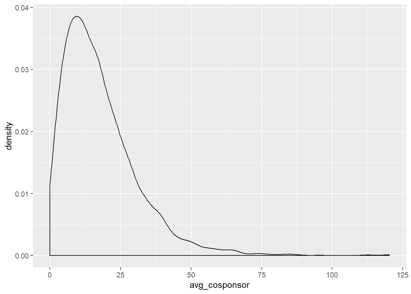
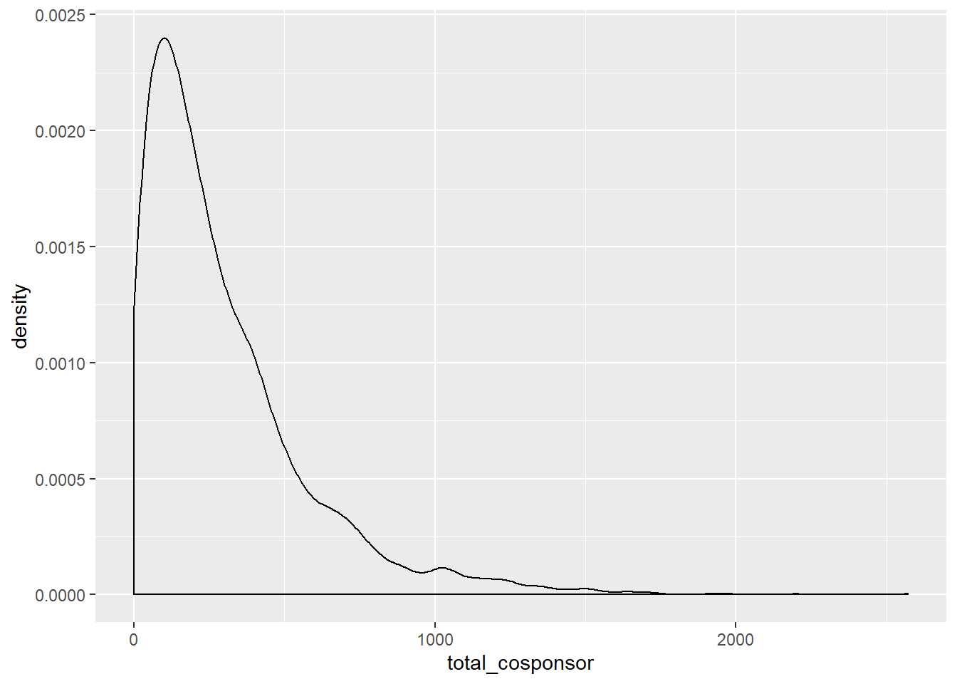
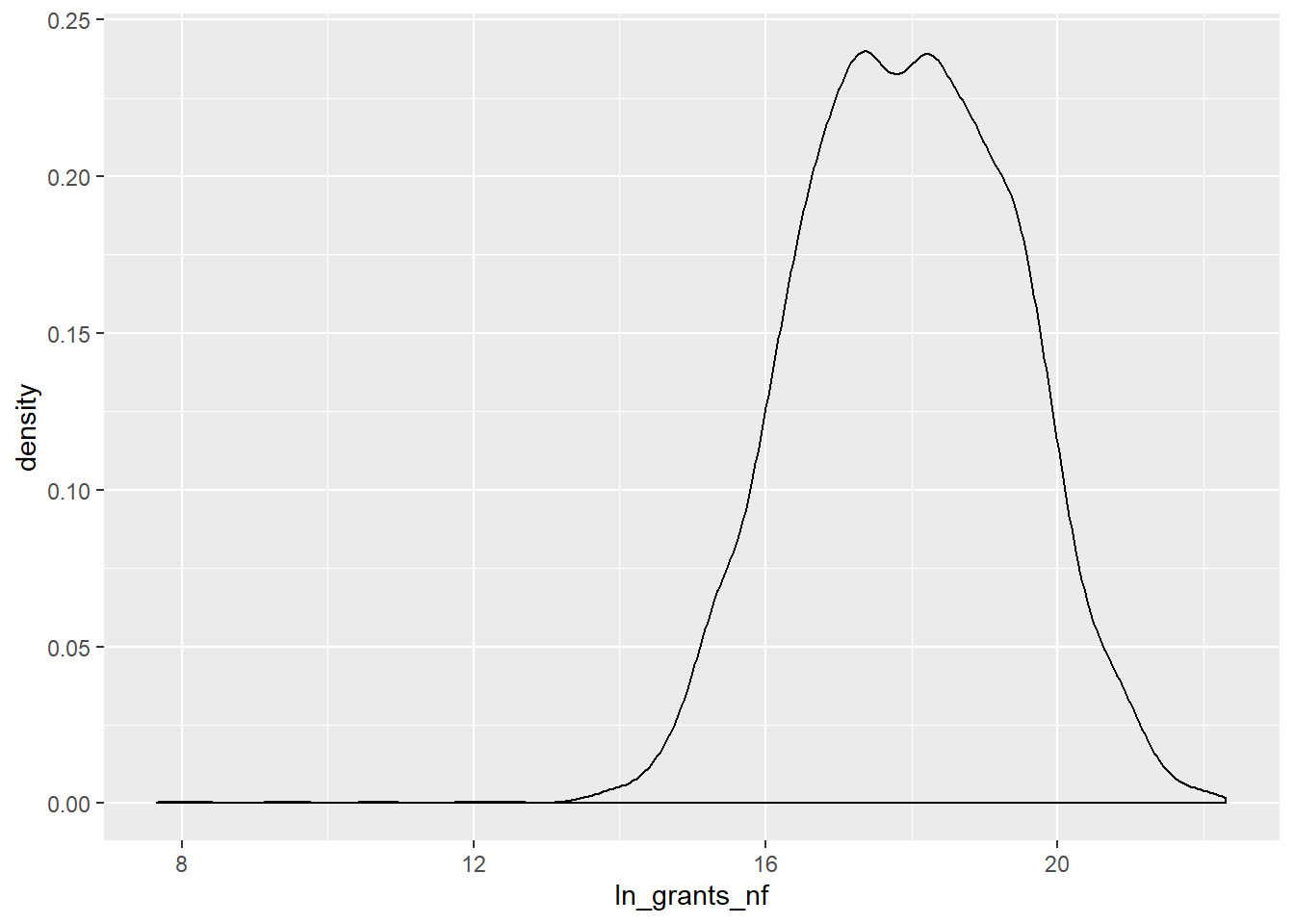
Both variables from the cosponsorship data are considerably right-skewed. If we were to use the total_cosponsor in a regression we might want to log it. The ln_grants_nf variable is more normally distributed, because it is already logged, though there are still some quite small outliers.
2.4.2 Correlations
Our next step might be to investigate some naive correlations. Somebody once told me that an interesting question should be at its face interesting in the descriptives of the data – plotting some correlations is one way to see this. This is also easy with ggplot. We’ll plot some of the above variables as correlations:
vw %>%
  filter(!is.na(avg_cosponsor)) %>%
  ggplot(aes(x = abs_val_dwn, y = avg_cosponsor)) +
  geom_smooth(method="lm")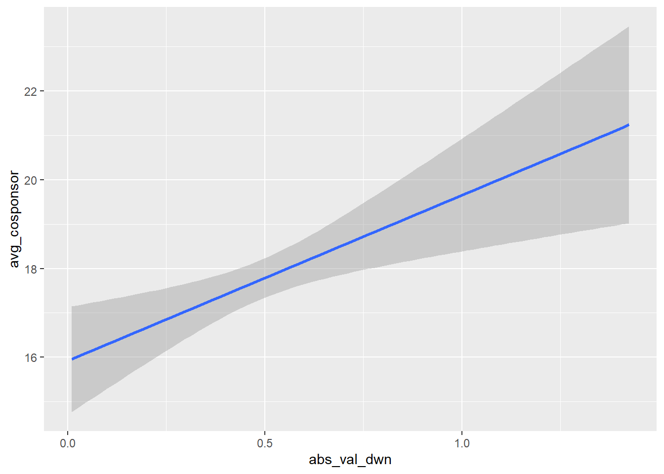
All that’s going on here is that we’re first dropping observations missing values for avg_cosponsor (remember, this is because of differences in the time period these datasets cover), piping that dataset into ggplot (an extremely useful feature!), and telling ggplot to use abs_val_dwn as the x-axis value and avg_cosponsor as the y-axis value. Then, geom_smooth(method="lm") automatically plots a line of best fit over the available data.
NB: you should not take the standard errors from geom_smooth seriously. This should only be used for descriptive purposes.
Let’s add in a couple twists. Let’s split this plot by party and add some points to the figure:
vw %>%
  filter(!is.na(avg_cosponsor)) %>%
  mutate(party = ifelse(`1 = Democrat`==1, "Democrat", "Republican")) %>%
  ggplot(aes(x = abs_val_dwn, y = avg_cosponsor)) +
  geom_smooth(method="lm") +
  geom_point(alpha=.2, shape=1) +
  ylim(0, 50) +
  facet_wrap(~party, scales = "free_x")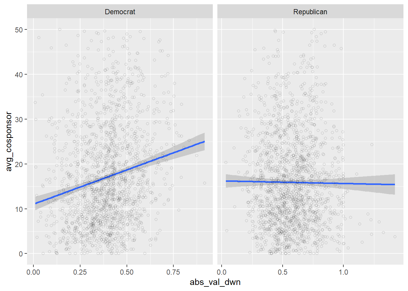
Fascinating! There seems to be almost no correlation between extremity and average cosponsorship among Republicans, but more extreme Democrats tend to have higher numbers of cosponsors on the bills, on average.
Let’s clean this plot up a bit more and put it into something that might be publication-worthy:
vw %>%
  filter(!is.na(avg_cosponsor)) %>%
  mutate(party = ifelse(`1 = Democrat`==1, "Democrat", "Republican")) %>%
  ggplot(aes(x = abs_val_dwn, y = avg_cosponsor, color=party)) +
  geom_smooth(method="lm") +
  scale_color_manual(values = c("dodgerblue", "red")) +
  geom_point(data = vw %>%
              filter(!is.na(avg_cosponsor)) %>%
              ungroup %>%
              mutate(party = ifelse(`1 = Democrat`==1, "Democrat", "Republican")) %>%
              mutate(avg_cosponsor = round(avg_cosponsor, 1),
                     abs_val_dwn = round(abs_val_dwn, 2)) %>%
              group_by(abs_val_dwn, party) %>%
              summarize(`Total Observations` = mean(avg_cosponsor)),
             aes(x = abs_val_dwn, y = `Total Observations`,
                 size = `Total Observations`), alpha=.1, inherit.aes=F) +
  facet_wrap(~party, scales = "free_x") +
  theme_bw() +
  theme(panel.grid.major = element_blank(),
        panel.grid.minor = element_blank()) +
  xlab("Abs. Value 1st Dim. DW-NOM") + ylab("Average Cosponsors per Bill")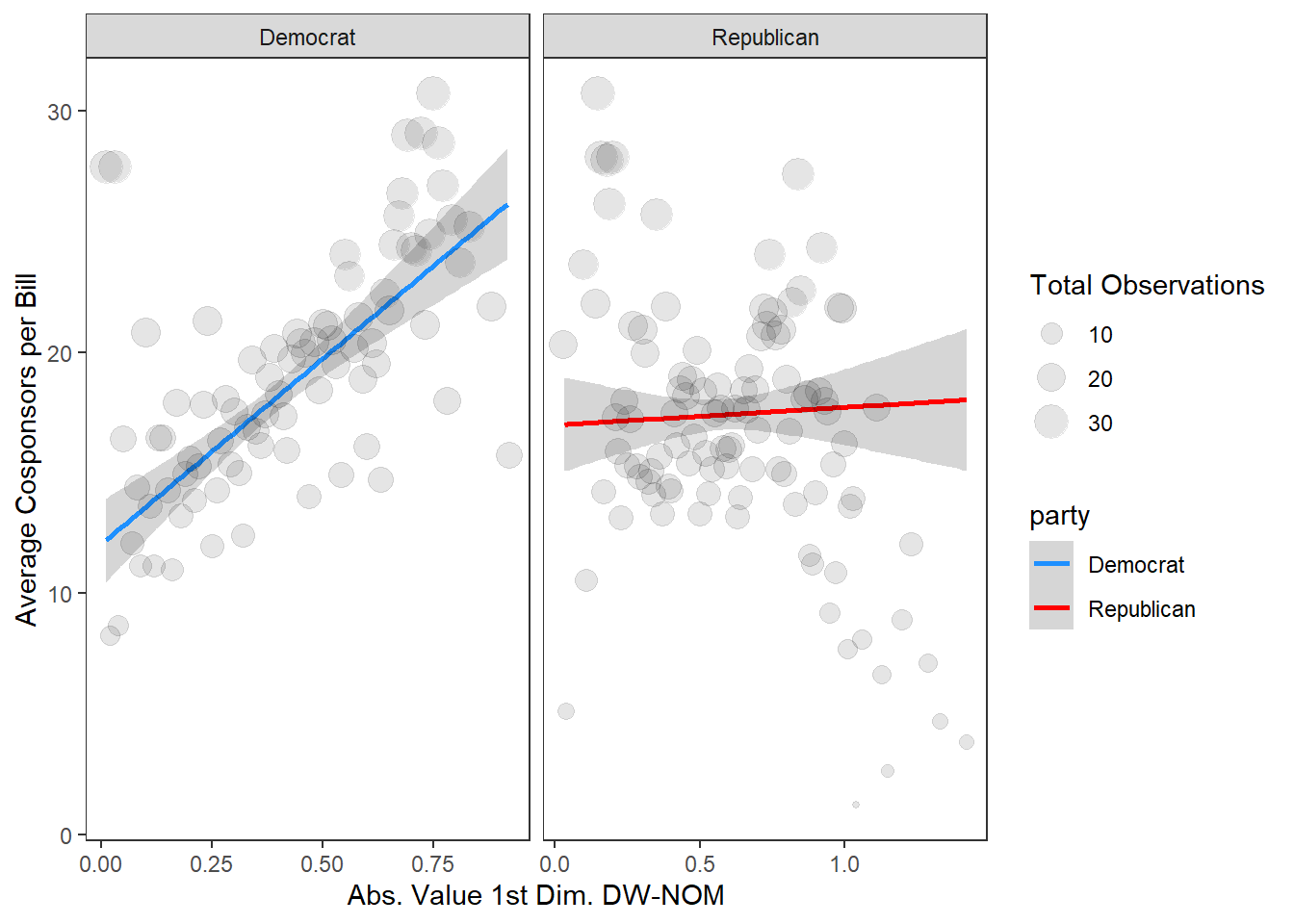
Not bad! There’s a lot going on in this ggplot code, but I’ll break down the basic idea:
- Do some basic cleaning to the dataset by filtering and creating the new
partyvariable; - Pipe this into
ggplot, telling it both the x and y axes and that we want to color the lines by party; - Plot the line, then manually color them blue and red;
geom_point: This is the complicated part; in the previous example that cloud of points isn’t particularly interesting. What I’m doing here is creating local averages at each x-axis value, and then plotting them as points with the size of the point related to how many observations are in that x-value;facet_wrapthe figure by party allowing the x-axis scale to vary by party;- Using a built in ggplot theme;
- Adjusting the theme a bit and adding in axis labels.
3 Creating maps
A really fun thing to do with congressional data is plot a quantity of interest on a district map. This is surprisingly easy. Here I’ll walk through how to do it, but see my other tutorial on maps in ggplot for much more information and further examples.
3.1 A map of the United States
This is so easy with ggplot, here’s all you need using the built in function map_data:
states_map <- map_data("state")

ggplot(states_map, aes(x=long, y=lat, group=group)) +
  geom_polygon(fill="white", color="black", size=.5) +
  coord_map()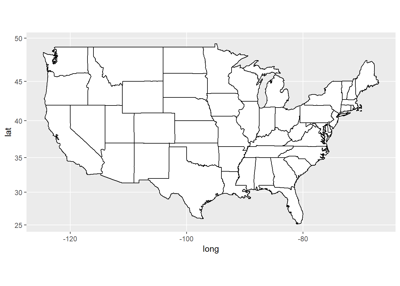
Incredible, right? Ok, let’s do a congressional district map.
3.2 Congressional district map
First, load in the USAboundaries package. Then, create a dataframe of the congressional map and plot it:
library(USAboundaries)

# ?us_congressional to see other options

cong.map <- us_congressional(resolution = "high")

ggplot(cong.map) +
  geom_sf()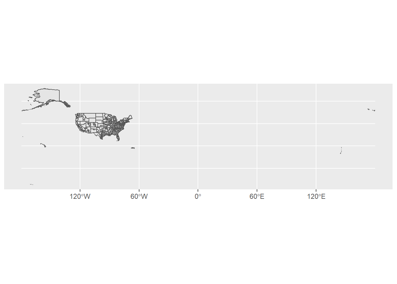
Yikes, ok we have some problems here with plotting the US territories and Alaska and Hawaii. Let’s limit the map to just the continental US to make things easier and try again:
cong.map <- filter(cong.map, state_name %in% state.name & !(state_name %in% c("Hawaii", "Alaska")))

ggplot(cong.map) +
  geom_sf(color="black", fill="white") +
  theme_void()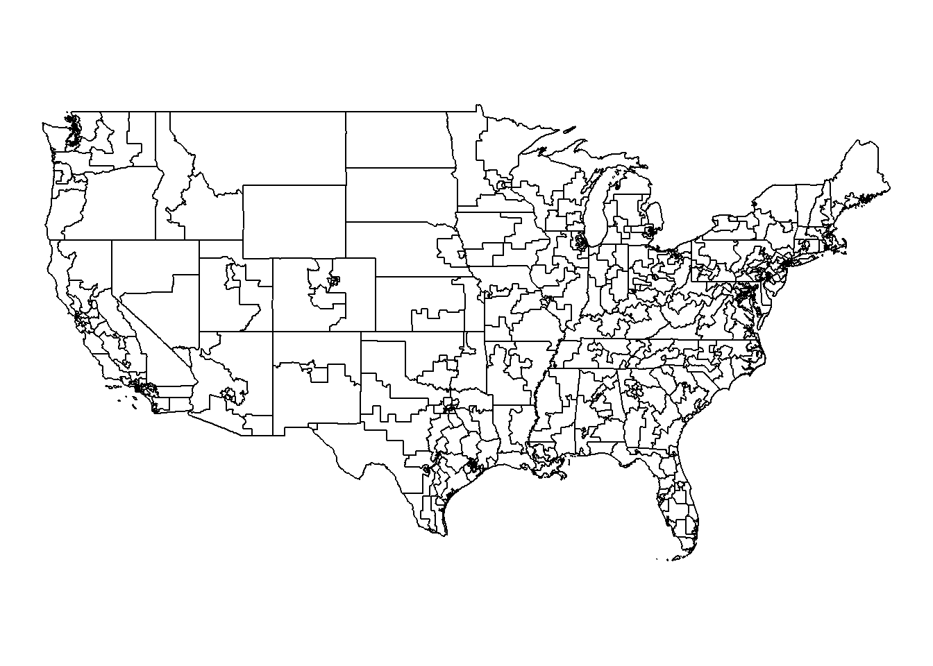
3.2.1 Plotting data with maps
Alright, great, we have our basic map. We can now work with the cong.map dataframe and join in other data of interest. Notice this dataframe has the variables state_abbr and cd115fp which make joining in data by state and district a breeze. Let’s now prep our data before joining it in. I’m going to plot Legislative Effectiveness Scores by district averaged across the 112th-115th Congress, since these are all in the same redistricting period.
map.data <- vw %>%
  ungroup %>%
  filter(cong >= 112) %>%
  mutate(state_dist = paste(state, district, sep=".")) %>%
  group_by(state_dist) %>%
  summarize(mean_les = mean(`Legislative Effectiveness Score (1-5-10)`))

head(map.data)
## # A tibble: 6 x 2
## state_dist mean_les
## <chr> <dbl>
## 1 AK.1 4.84
## 2 AL.1 0.281
## 3 AL.2 0.379
## 4 AL.3 0.235
## 5 AL.4 1.29
## 6 AL.5 0.235We now need to fix a couple of things in our cong.map data in order to merge (see the previous guide on messy data for more on this).
cong.map <- cong.map %>%
  ungroup %>%
  mutate(district = cd115fp %>% str_replace("00", "1") %>% as.numeric) %>%
  mutate(state_dist = paste(state_abbr, district, sep="."))
And now to merge:
And we’re ready to do some plotting!
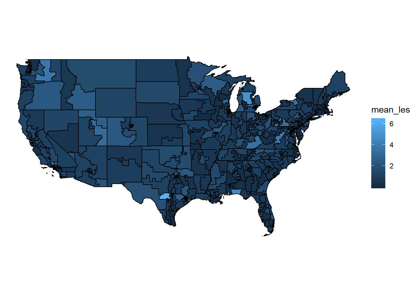
Not bad, but let’s exaggerate these differences a bit:
cong.map %>%
  mutate(mean_les = sqrt(mean_les)) %>%
  ggplot(aes(fill = mean_les)) +
  geom_sf(color="black", size=.2, alpha=.5) +
  scale_fill_gradient(low = "white", high = "red4")+
  theme_void()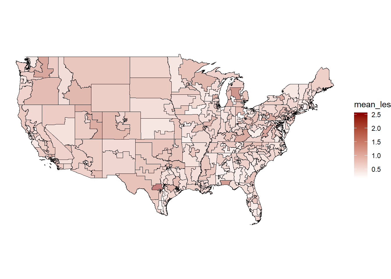
Very cool. We can also zoom in on a selection of states if we want:
cong.map %>%
  filter(state_name %in% c("North Carolina", "South Carolina",
                           "Virginia", "Tennessee", "Georgia",
                           "West Virginia", "Kentucky", "Alabama")) %>%
  mutate(mean_les = sqrt(mean_les)) %>%
  ggplot(aes(fill = mean_les)) +
  geom_sf(color="black", size=.2, alpha=.5) +
  scale_fill_gradient(low = "white", high = "red4")+
  theme_void()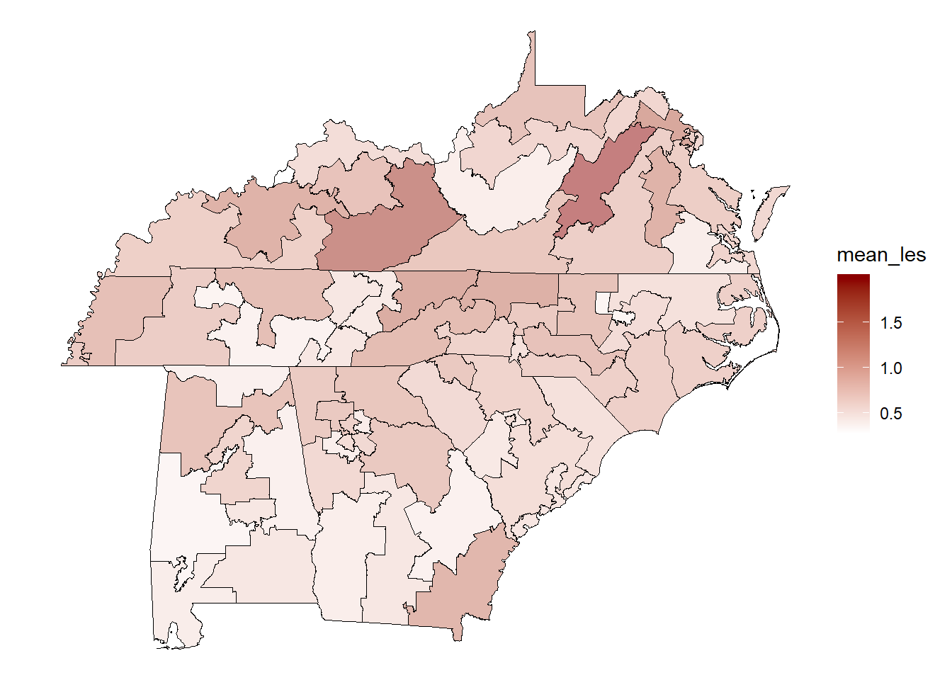
I’ll leave it there, but hopefully the flexibility of this is obvious. You can fill by whatever condition you want, such as census traits, bills introduced, ideological extremity, etc.